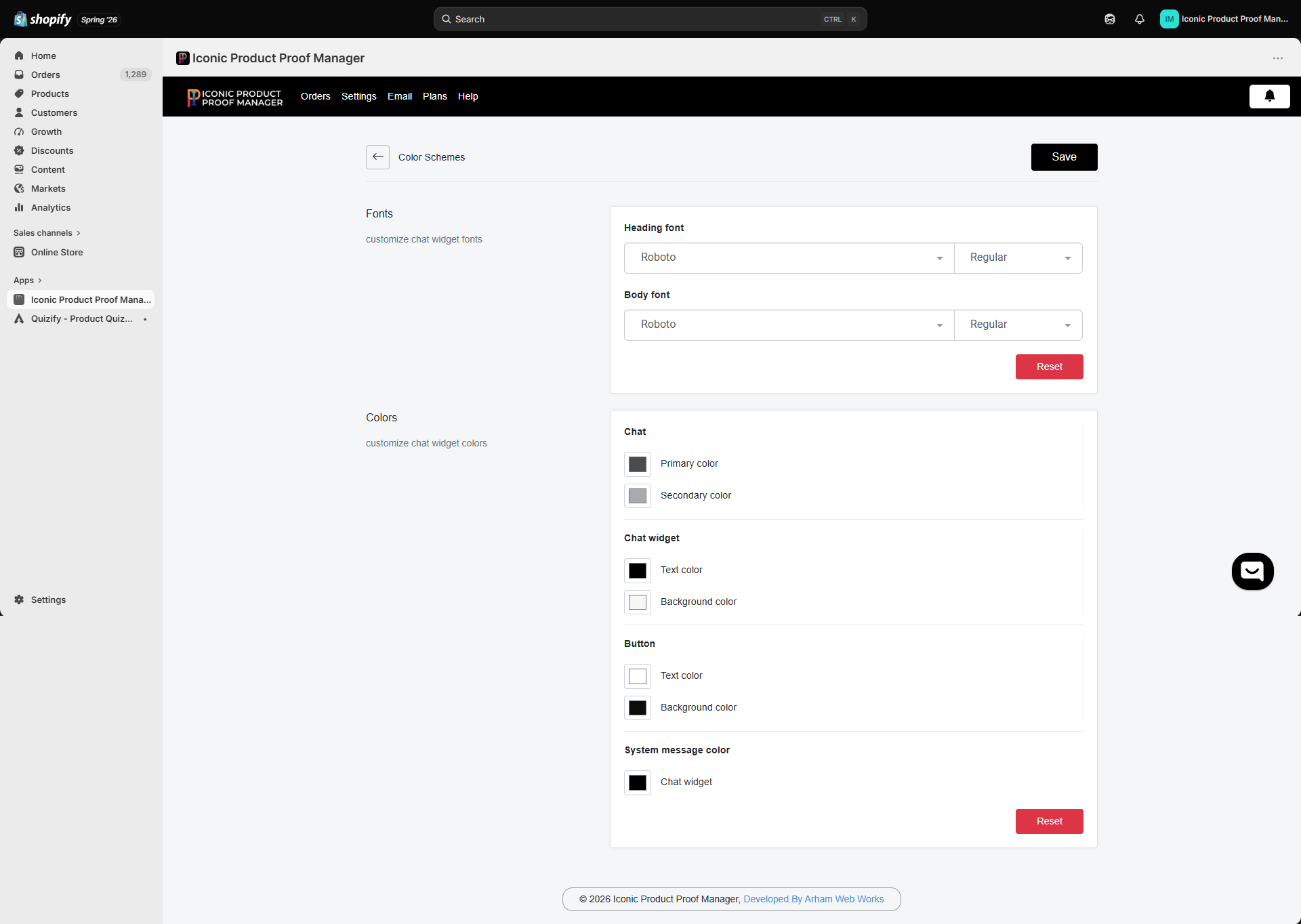
Settings → Design controls the visual style of the storefront chat widget, so it feels native to your theme rather than bolted on.
Fonts
Set separate Heading font and Body font, each with its own weight (e.g. Regular, Bold). Pick from the available web font library, or click Reset to return to the defaults.
Colors
Colors are grouped by where they apply:
Click a color swatch to open the picker, adjust as needed, and click Save. Use Reset to revert the whole color scheme to defaults.
Match your primary button color to your theme’s accent color, and keep chat widget text/background high-contrast — the widget doesn’t inherit your theme’s CSS automatically, so these settings are the only way to keep it on-brand.