> ## Documentation Index
> Fetch the complete documentation index at: https://proof-manager-docs.geticonicapps.com/llms.txt
> Use this file to discover all available pages before exploring further.
# Design Settings
> Match the chat widget's fonts and colors to your store
**Settings → Design** controls the visual style of the storefront chat widget, so it feels native to your theme rather than bolted on.
 ## Fonts
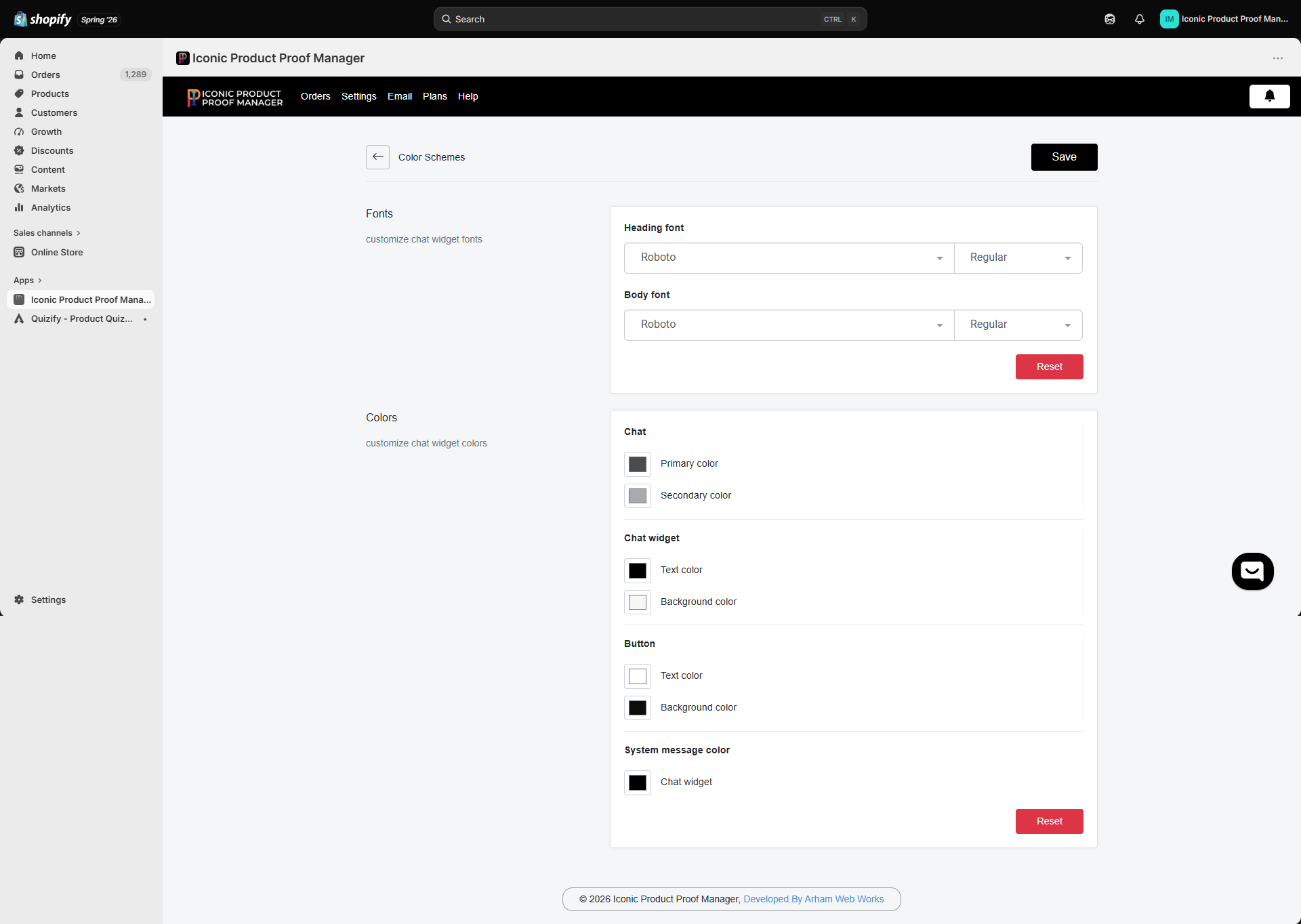
Set separate **Heading font** and **Body font**, each with its own weight (e.g. Regular, Bold). Pick from the available web font library, or click **Reset** to return to the defaults.
## Colors
Colors are grouped by where they apply:
| Group | Controls |
| ------------------------ | -------------------------------------------------------------- |
| **Chat** | Primary and secondary accent colors used throughout the widget |
| **Chat widget** | Text color and background color of the message panel |
| **Button** | Text color and background color of action buttons (e.g. Send) |
| **System message color** | Color used for system/status messages inside the chat |
Click a color swatch to open the picker, adjust as needed, and click **Save**. Use **Reset** to revert the whole color scheme to defaults.
Match your primary button color to your theme's accent color, and keep chat widget text/background high-contrast — the widget doesn't inherit your theme's CSS automatically, so these settings are the only way to keep it on-brand.
## Fonts
Set separate **Heading font** and **Body font**, each with its own weight (e.g. Regular, Bold). Pick from the available web font library, or click **Reset** to return to the defaults.
## Colors
Colors are grouped by where they apply:
| Group | Controls |
| ------------------------ | -------------------------------------------------------------- |
| **Chat** | Primary and secondary accent colors used throughout the widget |
| **Chat widget** | Text color and background color of the message panel |
| **Button** | Text color and background color of action buttons (e.g. Send) |
| **System message color** | Color used for system/status messages inside the chat |
Click a color swatch to open the picker, adjust as needed, and click **Save**. Use **Reset** to revert the whole color scheme to defaults.
Match your primary button color to your theme's accent color, and keep chat widget text/background high-contrast — the widget doesn't inherit your theme's CSS automatically, so these settings are the only way to keep it on-brand.